Sign pictures turn out to be favorites
September 16, 2022
This week my assignment for photography was signs. We could’ve taken this assignment literally or figuratively. I took it literally, and took most of my pictures on Keystone. I did a couple at night in Broad Ripple, but the two that I am going to write about are both from different spots along Keystone.
This picture was taken while I was actually going home from taking pictures, this was outside of a concrete business? I think? I pulled over because I liked the fence. I thought I could incorporate more than just the sign. 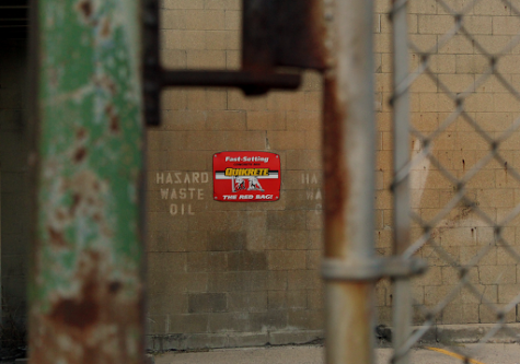
In some of my pictures I made the fence in focus while the sign was in the background blurred. For this picture I used my manual setting and set my focus to the sign. I framed it so I was able to get the fence on each side of the picture.
When editing, I brought out the red tones and green. Doing this made the red in the sign pop but also the rust on the fence. The green tones came out in the rust on the fence as well.
I refrained from photoshopping any “imperfections” out as I wanted to keep the look of the distressed wall. Pulling the exposure down gave a more muted tone to the picture.
This picture is of a dumpster outside of the restaurant “The Mouse Trap”. I was pulled in by all of the graffiti and color tones. I got up close and zoomed in so nothing but the dumpster was in frame.
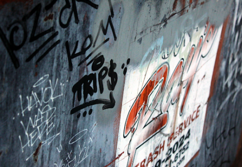 I was at a higher angle and pointed my camera down, this allowed for a downward diagonal angle. I think this angle emphasized the corners of the white and red square logo. I used the close up setting on my camera.
When editing I brought out blue the colors and turned down the exposure. Then I upped the brightness, I was able to emphasize the absolute blacks and whites in this image.
This picture is one of my favorites I’ve taken this year. I love the composition and bold colors. I really like the small details like the distressing on the top of the Rays logo too.
“What Lies Beyond” theme inspires enticing photos
This week I picked two pictures for my “What Lies Beyond” project. I took all of my pictures on Keystone and the Monon. My two favorite pictures that I am talking about today were both taken on Keystone.
The first picture was taken at an abandoned building. I took a picture of the side of a window pane that was distressed. It also had a piece of broken glass from what looked like a beer or soda bottle.
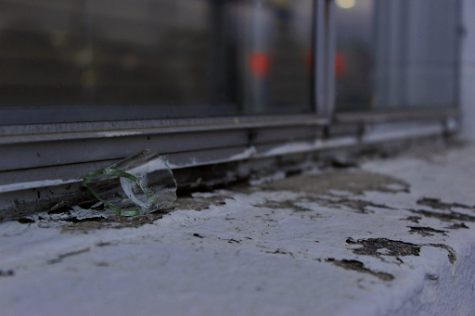
Using the rule of thirds, I focused on the broken glass and wanted the lines along the window to take you to the back right of the picture. I used close up mode on my camera which when setting the focus to the bottle, it blurred the rest of the picture.
When editing, I balanced the lighting using curves. I also brought out the light blue tone to bring out the broken glass, as well as brightening red, which made the car lights in the reflection of the window stand out. I like this picture because I think it fits the theme well with all the distress and brokenness.
My next picture was taken outside the laundry mat on Keystone. On the side of the building there was a distressed guard rail. I focused the camera on the edge of the guard rail and put the camera in landscape mode. I set the camera almost directly in front of the end of the guard rail, so the rest of the guard rail took you straight back.
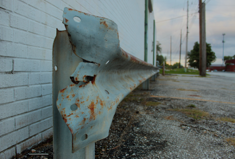
When editing this picture I messed a lot with the contrast and pulled out lots of green, teal and red tones to make the rust pop. I really like how far this picture takes you back and all the colors. I also like the dirty ground and white bricks of the building.
When we did class critiques, a lot of my classmates said they liked how the rest of the background looked like a ghost town. This made it go along with the assignment well, and I think the empty road was beneficial to the picture. This second picture is one of my favorite pictures I have ever taken.
Orthodox church highlights color – September 30, 2022
Over the past two weeks I have had a couple of assignments. My favorite photos I have taken and edited are from my religion project. When this project was introduced I knew I wanted to express a religion I was unfamiliar with. When looking at churches to go to, I found a Greek Orthodox church in Carmel. The Holy Trinity Greek Orthodox church had really beautiful high ceilings and lots of colors. I called ahead and got the OK to go in and take pictures. They had just finished up “Greek Fest” so there was a lot of activity going on.
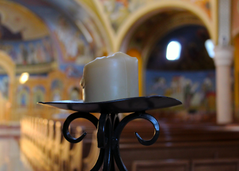
The first picture I took was taken from the back of the church, zoomed in on a candle. I was able to focus on just the candle using portrait mode and got a blur of many mixed colors in the background. In the background you can see the rows and rows of pews and the arches in the ceilings. When editing I turned the exposure down to focus and made the colors in the back more vibrant.
The second picture I took was a zoomed in picture of the top of a pew. At the end of each pew there was a carving in the wood near the top. I angled my camera so I could focus the most on the hole of the carving. Through the hole you can see the colors of the ceiling and wall. The back of the picture, like the first, is blurred and you can see the form of the arches on the ceiling. 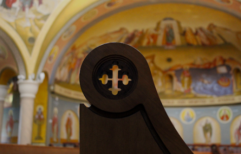
I like both of these pictures because they go together well and remind me of paintings. The arches in the church were my favorite part and I am glad I was able to suddenly incorporate them into the frame. Each photograph is so colorful yet very subtle and not loud. The owner of the church was very nice and asked me to send her some of the pictures I took.
Cemetery photos expose detail – September 16 2022
This semester, I am taking advanced photography. Throughout these past two weeks my favorite two pictures I have taken and edited are pictures from my cemetery project. I went to Union Chapel Cemetery during sunset. I was able to get lots of shadows in my pictures, which I think added a strong emphasis to the form of the objects.
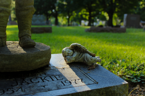
The first picture is of a tombstone with a small soldier statue and an even smaller baby angel adjacent to the soldier. I focused on the baby angel and used the shadows to add form. Making the background blurry by having my camera in portrait mode put focus on the stone.
When editing, I focused on turning the brightness and exposure down. I also adjusted the coloring to make sure it was rich in green. Doing these two things, I was able to make the shadows stronger and emphasize the bright green grass. This editing also revealed the slight moss on the stone. 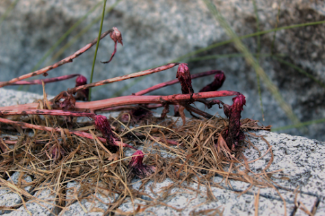
In the next picture you may not even be able to tell that it was taken at a cemetery. I took a close up picture of dead flowers placed on a tombstone.
When I was at the cemetery, I noticed that each tombstone had a different upkeep. Some tombstones were clean and had fresh flowers beside them, while others were dark moss covered, and had either dead or no flowers. I focused in on these dead flowers because not only do I think this symbolizes a lot in a cemetery, but the dark coloring of the flower was still present.
When editing, I focused on bringing out the dark red and purple shades. I used a close-up mode on my camera when taking the picture to make sure every detail was caught. Surrounding the dead flowers are little green pieces of grass, which are not in focus but add good color contrast.
I chose these two pictures from the past two weeks because I was able to take close-up detailed pictures with this assignment. Close-up pictures are my favorite to get, I like when you can see every detail. Zooming in on a big part of an object adds meaning to the small things. Details are important and are in everything.